Star Wars Episode 7 "Jedi Recluse" Original Poster Art For Sale

raybengeart

New member
Joined
Dec 30, 2015
Messages
1
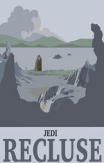
I am an artist specialising in depicting locations in a retro poster theme, and I have just created one of "Jedi Recluse" which is from Ahch-To in the most recent film. I would love some feedback. I wanted to capture the gloomy eeriness of the place which i hope i have achieved.
http://www.raybengedesign.com/star-wars.html
 

Attachments

  • starwards.JPG
    starwards.JPG
    13.4 KB · Views: 609
Hey c'mon, that's not cool! Why are people trolling the sales section today... :(

Nice artwork mate, ignore that comment above.
 
Bonsai_Tree_Ent said:
Hey c'mon, that's not cool! Why are people trolling the sales section today... :(

Nice artwork mate, ignore that comment above.

He asked for feedback you know :lol:

It reminds me a bit of those 1920s type posters for Blackpool or Brighton. All you need is a platform, a steam traIn and a nice knitted bag for Luke and he's all set for a nice holiday.

It's not to my taste but good luck selling it (in the right place a ands with a price :lol: )
 
Bonsai_Tree_Ent said:
Hey c'mon, that's not cool! Why are people trolling the sales section today... :(

Nice artwork mate, ignore that comment above.
In fairness I think most of the SW art that appears os pretty cool but this section is for vintage items so there is bound to be a bit of thread bashing.
 
He did ask for feedback.

I was only being honest.

people that get told there amazing all there life because nobody wants to hurt the feelings and then one day they finally go and sing on X factor and learn some harsh truths.

Just telling it how it is, that's all.

Sorry if I offended
 
Looks like it's the poster bashing day for some reason :lol:

Everyone's entitled to their own opinion although maybe constructive criticism can be more useful to the artist. I quite like it and can see that idea was to get the feeling of those last couple of shots from TFA, which I personally think has been achieved here.

One thing about the very last shot from TFA was that the slightly shaky aerial shot seemed a bit unnecessary to me and I wish it had cut the shot before. Didn't ruin it or anything but just stood out to me as feeling strange.

Anyway, liked the poster and keep up the good work! :D

Ian
 
I like the poster but as it's been said, it's in the wrong section and needs a price.
 
In terms of feedback...

I like the composition;
I'm not keen on the font;
I'm not sure the pastel colours help convey gloominess - it could be that the cloud is too bold against the sky and/or Luke and the background are too sharp & 'in-focus'.

Good luck with it though. :)
 
peekaygee73 said:
In terms of feedback...

I like the composition;
I'm not keen on the font;
I'm not sure the pastel colours help convey gloominess - it could be that the cloud is too bold against the sky and/or Luke and the background are too sharp & 'in-focus'.

Good luck with it though. :)


Now that's some good feedback and I must admit I tend to agree on most points although I still like it overall :)

Ian
 
It's pretty cool but I have to agree it is a boring and the text just throws it all off. To me the text it's not needed, what makes art great is how the picture can tell the story, and for the people that seen the movie they pretty much know what's going on anyhow :lol: I would have mixed some really bold colors with the mono tone. Maybe the background that the Jedi is looking at could've popped more. But to each their own!

Now make sure you introduce yourself 1st and read the forum rules before you start selling your **** here buddy! Say hi 1st and post in the right spot and we won't roast you like a turkey in thanksgiving you turkey :twisted:

Yo @TiefighterBoy what's up my brother :lol:
 
Old Thread: Hello . There have been no replies in this thread for 365 days.
Content in this thread may no longer be relevant.
Perhaps it would be better to start a new thread instead.
Back
Top Bottom