SWF Logo Competition

Status
Not open for further replies.

JuniorChubb

Sith Lord
Joined
Apr 10, 2012
Messages
4,385
Location
London
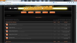
All depends on the control Edd has on the template Pete...

If he can access the template files or the stylesheet then changes are possible. If he's locked out its as PC suggests, fixed image size at about 90px...

Like your latest tweaks too. 8)

Are we going to go for a time frame on this, then a multi stage megavote, or is it left with Edd to make the final decision...

Edd?

I am hoping we are not in a rush because I am sure there are a few more people that have ideas to put forward...
 

Frunkstar

Grand Master
Joined
Sep 5, 2007
Messages
5,653
Location
North Wales - Beyond The Outer Rim!
If it goes to a vote your all screwed, I'm bound to win hands down
rofln.gif
 

PGowdy

Grand Master
Joined
Apr 11, 2010
Messages
6,738
Location
London
JuniorChubb said:
Typical Frank, looks like you've got it in the bag :wink:


Sorry lads, I will get my coat :oops:

Edd said 1st December. So quite a lot of time for people to get their crayons out and get scribbling. :D
 

Bramistuta25

Sith Lord
Joined
May 27, 2011
Messages
2,604
Location
A galaxy far, far away...
PGowdy said:
I tried silhouetting the original figures for my banner design as suggested but they just looked too vague and nondescript at that size. Didn't really add anything. The original one looked better.
But i thought i'd do a 'reall-ilfe' full colour version using the first 12 Kenner figs. This was a pain in the arse but at least it incorporates vintage figures.

newerbanner_zps7d6a1261.jpg

Love this one.Is it possible to spread the figures out or maybe do it like the 12 back version. Plus I would lose the forum off the bottom line. Just Vintage Star Wars Collecting as I has forum in the main part in the middle.

Just a suggestion, but Pete's gets my vote!!

Awesome
 

PGowdy

Grand Master
Joined
Apr 11, 2010
Messages
6,738
Location
London
Bramistuta25 said:
PGowdy said:
I tried silhouetting the original figures for my banner design as suggested but they just looked too vague and nondescript at that size. Didn't really add anything. The original one looked better.
But i thought i'd do a 'reall-ilfe' full colour version using the first 12 Kenner figs. This was a pain in the arse but at least it incorporates vintage figures.

newerbanner_zps7d6a1261.jpg

Love this one.Is it possible to spread the figures out or maybe do it like the 12 back version. Plus I would lose the forum off the bottom line. Just Vintage Star Wars Collecting as I has forum in the main part in the middle.

Just a suggestion, but Pete's gets my vote!!

Awesome

Do you mean actually use the first 12 image from the card back? I'll give it a try, see how it looks.
The figures can be spread out quite easily. I'll give it a try tomorrow.
I get what you mean about the "forum" in the bottom line. It bothered me too but it's there to make the line the right size. Perhaps a different wording that's just as long. Any suggestions?
 

PGowdy

Grand Master
Joined
Apr 11, 2010
Messages
6,738
Location
London
There you go Bram.

It actually does look pretty cool to be fair.

erbanner_betterundertext_12backversion_zps8d1f77ed.jpg


I could change the text at the bottom to - VINTAGE STAR WARS COLLECTING SITE ? Unless anyone can think of something better?
 

Jedi_june

Sith Lord
Joined
Nov 25, 2012
Messages
2,252
Location
Be$piN NEW YORK NY :D
JuniorChubb said:
Cheers Jeff, I like the effect. :D

Pete, I was going to go with a thinner line around the text and red like ROTJ. I also wondered about the figure silhouettes being vintage figures rather than the actual people. Sorry to add to your workload :wink:

I have put together another idea I had knocking about. I have used the style of the early Ep4 fmovie posters and replaced Vader, Luke, Leia, R2, Threepio, the Death Star and the X-wings with there Vintage counterparts. I haven't quite matched the font 100% but its close enough. This would also need a bit of tinkering with the website to get the images to sit behind the buttons so it may be out of the running from the off...


One more idea in the pipeline, using the SWFUK/Palitoy logo...


I'm really Loving this one by Junior! Really cool, can't wait to see some updates on this one. Is that the Palitoy deathstar :shock: that's kick ass!
 

chazb73

Sith Lord
Joined
Sep 1, 2012
Messages
2,458
Location
Scotland
Here's my updated and revised design. It will fit into the current space (if more is allowed then great - I can update it if needed)

(just realised I forgot UK at the end :roll: easily fixed though)
 

Attachments

  • swfbanner2.jpg
    swfbanner2.jpg
    90.4 KB · Views: 276

spoons

Grand Master
Joined
Oct 22, 2006
Messages
8,314
They are all cracking efforts guys, Pete your banner gets my vote - it looks fantastic with the tweaks.

If it is chosen maybe we could come up with a site motto for the lower text, how about trying the scum and villainy one for the time being?
 

PGowdy

Grand Master
Joined
Apr 11, 2010
Messages
6,738
Location
London
spoons said:
They are all cracking efforts guys, Pete your banner gets my vote - it looks fantastic with the tweaks.

If it is chosen maybe we could come up with a site motto for the lower text, how about trying the scum and villainy one for the time being?

With real first 12 figs.
_WRETCHEDHIVE_betterundertext_textredo_zps5b2d332a.png


With 12back first 12 image.
_WRETCHEDHIVE_betterundertext_textredo_zps7694c6e7.png
 

TC-14

Sith Lord
Joined
May 22, 2013
Messages
1,179
Location
West Yorkshire
With the first 12 image from the original card in my opinion, definitely.

Smashing effort, chaps- quality work on display...
 

spoons

Grand Master
Joined
Oct 22, 2006
Messages
8,314
Great Pete - I prefer the actual figures rather than the 12 back image
 

mumbo

Sith Lord
Joined
Sep 27, 2012
Messages
3,866
They are all contenders lads, great stuff 8)

Will await the final editions before nailing my colours, either way we will have a header to be proud of :)
 

Jedi_june

Sith Lord
Joined
Nov 25, 2012
Messages
2,252
Location
Be$piN NEW YORK NY :D
@Chazb: that's so cool Andy, I really like that one. The saber is ace.

@PGowdy: Great work Pete, and I myself like the one with the real figures.

Can't wait to see the final pieces to vote on.


Oh can I enter the banner in my signature :shock: but without my name tattooed on her arm :lol: :lol:

Keep up the great work, a lot of talent in this forum.
 

edd_jedi

Moderator
Staff member
Supporter
Joined
Oct 19, 2006
Messages
8,913
Location
UK
Pete, I really like yours, but I'm worried it might be too big. I don't want a stupidly massive one like TIG has that puts everything below the fold unless you have a 32" monitor :lol: Could you do a mock up with it to scale? Definitely a winning contender though mate!
 
Status
Not open for further replies.
Top Bottom